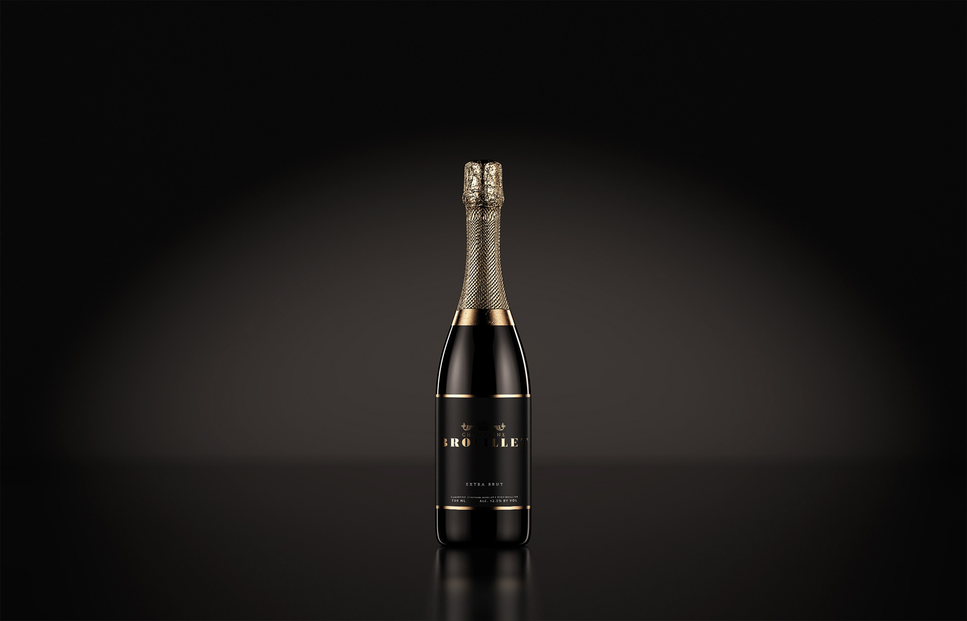
Champagne BROUILLET
A personnel project based off champagne bottle design study & study with me stream
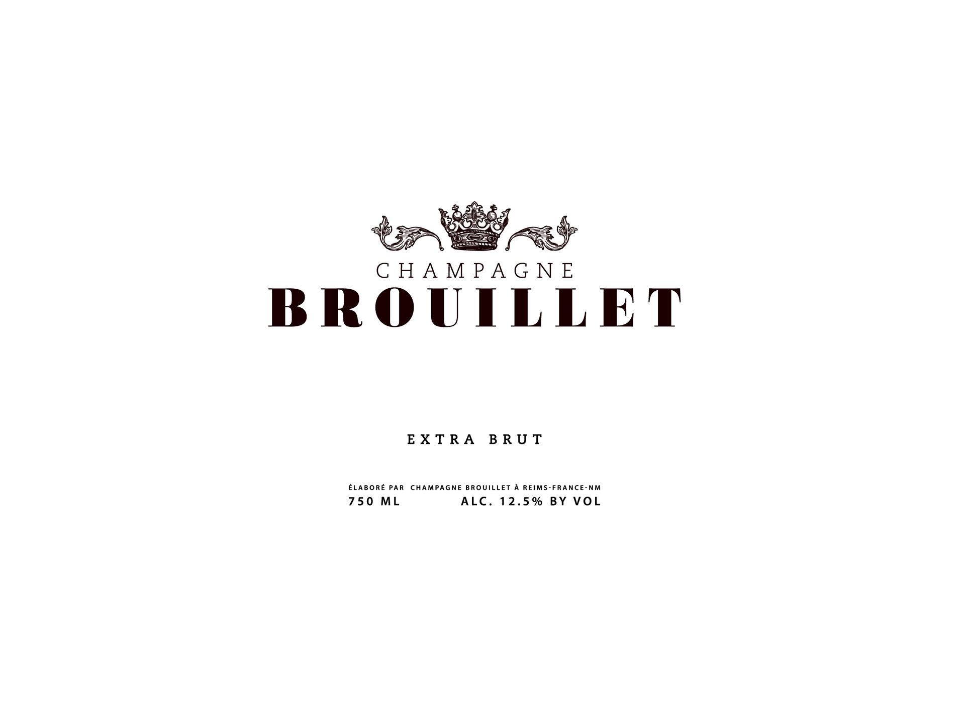
When I started graphic design, one of my first personnel projects was a champagne bottle, I had done 0 research and absolutely winged it. Half a decade later, I'm doing another design based off my personnel interests. I started with the word Sanctuary and the more I went down the rabbit hole of studying, the more I knew the direction I wanted to go
I opted to go with a alternative way to write a family last name, I then went on to research it and its provenance, as well as mixed in some of my current studies on typography. I wanted the bottle to seem Bold & delicate at the same time, as well as modern & old. Most of all I wanted this design to be a part of my personality as well, an ancestral homage to my roots. Of course a champagne bottle is nothing without a small touch of luxury added with the gold foil.
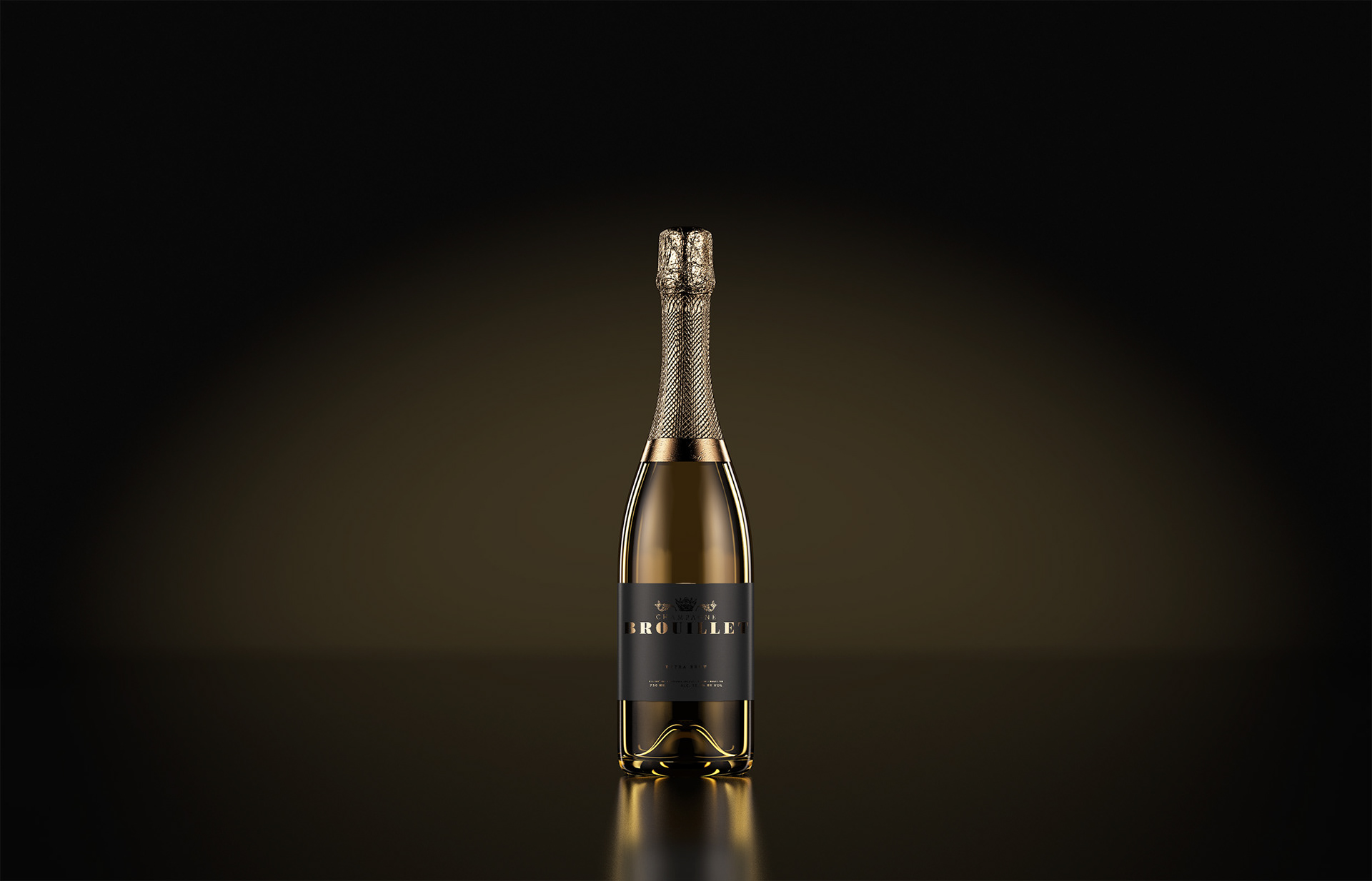
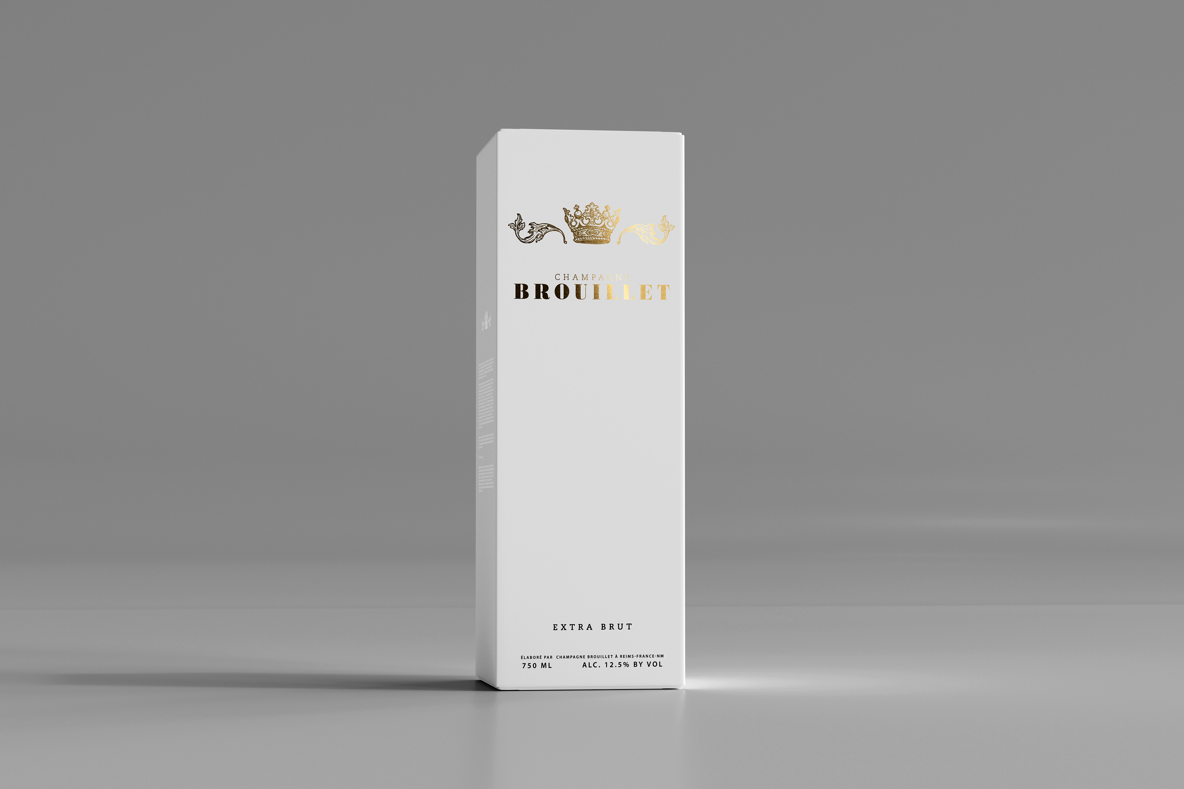
I chose a white box compared to the black bottle because the personality I wanted to throw in was the ying-yang aspect of life, I wanted to evoke balance between different aspects of design and product.
You can find the project study here in a work with me format :
Thanks for looking at my project, I look forward to sharing more of these types of projects on here